
Blimey this guy must of spent a lot of time scanning the planet to find all these. My favourite is the letter ‘M’, what’s the chance of a farmer having fields like that?
Cheers for the link Ollie.

Blimey this guy must of spent a lot of time scanning the planet to find all these. My favourite is the letter ‘M’, what’s the chance of a farmer having fields like that?
Cheers for the link Ollie.
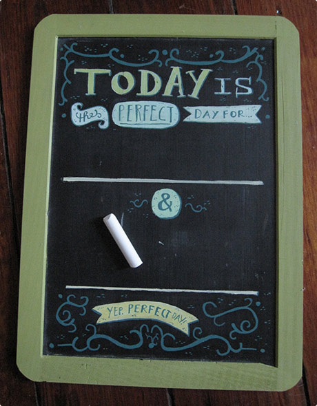
Me & Nicky have been thinking about getting an old chalkboard for the house. Now I’ve seen Mary Kate McDevitt’s Mini Goal Chalkboard set, I’m insprired to go out and customise themself one.
She did have some for sale on her etsy, but they’re all gone now.
Via: Drawn.
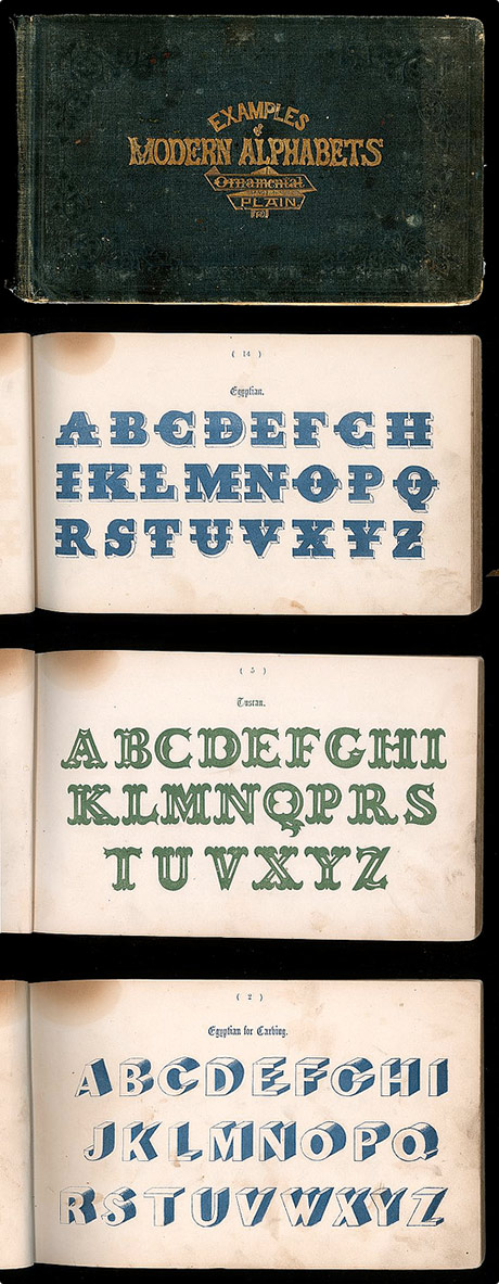
It’s funny to think that some of these typefaces were ever considered ‘modern’, but also quite surprising how ‘modern’ some of them actually are for 1864! The Modern alphabets circa 1864 was scanned by Depression Press, who has a plethora of empheria sets to check out »
Via: DETOUR.
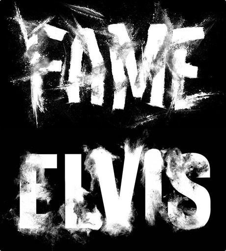
Sean Freeman is knocking out some very tastey type treatments. My favourites are the chopped up charlie Fame and the hairy Elvis pictured.
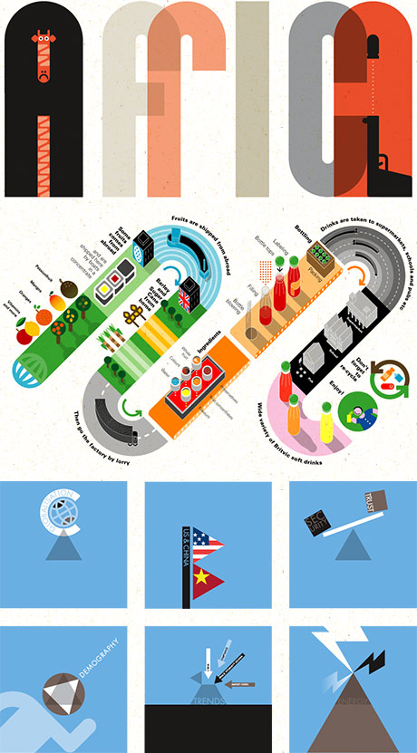
Just been looking through Grundini, the online portfolio of Peter Grundy. A lot of the work feels familiar then I read he’s been doing his stylised infographics, illustartion, art and type since 1980 and still going strong. Made me think about the future of my career and where I’ll be in 2030?! I’ll I hope I’m still designing and drawing, and I hope that it’s as good as Peter’s work! Anyhow, be sure to check out his hi-res downloadable book.
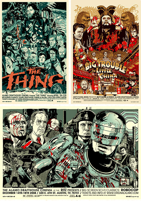
It looks like Tyler Stout gets a lot of work out of The Alamo Drafthouse Cinema, making classic movie posters for them. Hope they pay well, because they’re painstakingly drafted and super detailed, must of taken an age to create each one.
Via: The Glue Pot
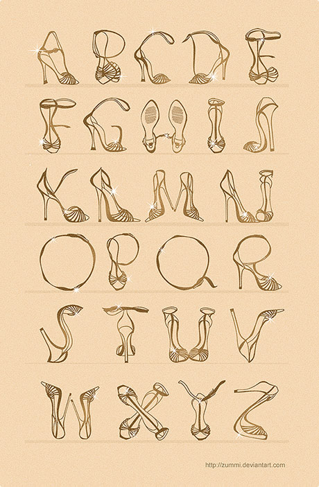
It’s remarkable that Zummi managed to create a whole alphabet from nothing more than a couple stilettos! Think that ankle strapping helped a bit though.
Via: UPPERCASE
I‘ve lost count how many times I’ve blogged about this guy, but Alex Trochut is simply doing the best work out there (in my opinion). He’s just updated his site with some fresh works, so get over there and check out the standard which we mere mortals have to try and step up to and match.
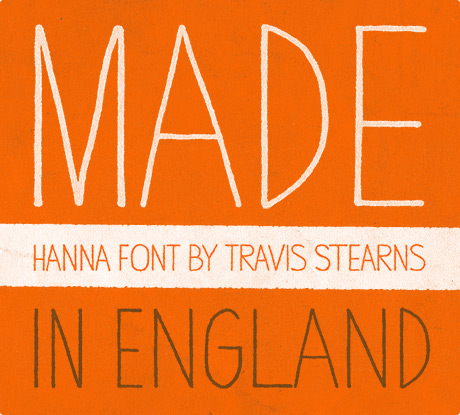
I‘ve been looking for this font for a while, what the font didn’t have a clue, but here it is – say hello to Hanna. It’s a bit reminiscent of the hand drawn type in Dr. Strangelove’s title sequence. Designed by Travis Stearns among many other typefaces on the YouWorkForThem site, I also bought Neighborhood.
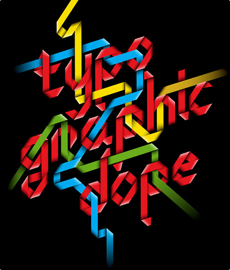
I‘ve blogged about Mootsie before, he won the 2007 cpluv t-shirt competition with I wish I could do this with my penis. Now he’s back with this awesome poster Typo-graphic Dope, check out the detail on the shading, that’s a perfectionist. Available to buy as a poster (along with his penis t-shirt) from his MySoti page.