If you’re in Belgium next week, I’d highly recommend the opening night of Eugene & Louise Bakery. The marzipan characters they make are amazing:
And the packaging for their chocolate bars is spot on:
Cheers for the link Asi.

If you’re in Belgium next week, I’d highly recommend the opening night of Eugene & Louise Bakery. The marzipan characters they make are amazing:
And the packaging for their chocolate bars is spot on:
Cheers for the link Asi.
Arrr, so ye be wantin’ t some booty? Then ye best download this weeks desktop har, it’s another sticker I be doin’ for visitors to the good ship Poke. Aye.
This is pretty awesome, music video for Shit Disco’s track OK is all done as pop-up book, nice.
Cheers for the link Mattias.
The Nonist has a great post about the bad language in baseball circa the 1890’s. Apparently it was so flithy that they had to issue Special Instructions To Players, but the best bit is they reprinted some of the most offending language:
“You cunt-lapping dog!”
“I’ll make you suck my ass!”
Genius, good to see things haven’t changed much! More about the document here.
Via FFFFOUND!
By popular demand, this is as demo of how I draw with Illustrator ;) To be honest I’m completely un-aware of how other illustrators use it and I’ve never had any lessons or read an instruction manual, this is just what what works for me. I always start with a scanned in sketch, I only draw directly on a blank page if it’s something really simple or geometric. I’ll not get into drawing and sketching here, might write another post about that some other time. I generally lock the layer the sketch is on then draw over it on another layer with the pen tool. Hopefully by watching the video you should get the idea, below is a bit more in-depth info.
The pen tool:
![]()
This is what Illustrator is all about for me, the pen tool is pretty much the only thing I use. I know a lot of people that don’t use Illustrator because they can’t get the hang of the pen tool, I suppose it isn’t that intuitive, but it’s pretty simple once you get the hang of it. Click and stretch – everytime you put an anchor point down you can move your cursor while the mouse button is held down to affect the curve. If for example you’re drawing a ‘s’ shape and you want the curve to flow gracefully one way to the next, just keep adding anchor points and Illustrator automatically flows the curve (no idea what the proper technical terms are for this stuff!) If you want to make a hard corner you hold down the Apple key (cursor turns to little white arrow) and click the canvas (not on the line). Now if you click on the last anchor point you can carry on as before and send the line off at a sharp angle.
Tweaking the handles:
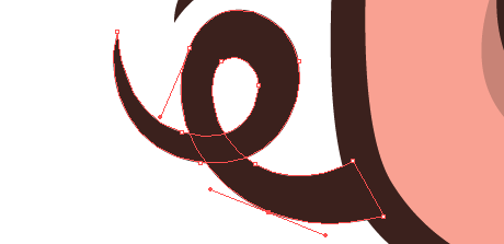
![]() This is the key really, you try and draw it right with the pen tool, but you’ve always got to select the odd anchor with your little white arrow at some point and tweak them. Just click it, move it around, pull it’s handles in & out until your curves are looking just right. You can hold down the Apple key to get this tool while using the pen.
This is the key really, you try and draw it right with the pen tool, but you’ve always got to select the odd anchor with your little white arrow at some point and tweak them. Just click it, move it around, pull it’s handles in & out until your curves are looking just right. You can hold down the Apple key to get this tool while using the pen.
Colour palette:
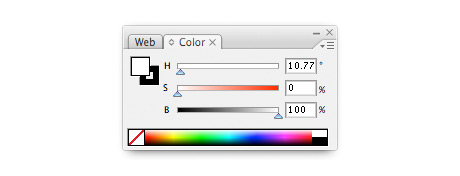
It’s down to personal preference I suppose, but I like to use the HSB colour palette over RGB or CMYK for making the colours I use. Mainly because I prefer my colours unsaturated – you can find the Hue you want with the top slider (H), then I generally take the saturation down a bit (S) slider and add a bit of black (B).
Pathfinder palette:

This is a really handy palette that I’m always using. Not sure what half the stuff does, but (1) joins shapes together – remember to click expand afterwards (from the menu bar: Object > Expand) And (2) divides over lapping shapes – remember to ungroup afterwards (from the menu bar: Object > Ungroup) Trust me, they are more useful than they sound!
Any questions just ask! I’ll try and update this post with feedback. Confused about of pork nose? Just playing around with the Poke’s logo, which my missis designed incidently.
This is a nice idea, cellotape dispenser in the shape of a cassette tape. Made by j-me, who have a few other interesting products, such as the groinal keyholder.
Via Yacco’s blog.
For a long time I have genuinely wondered why a book all about cooking with booze didn’t exisit? At one point I even toyed with the idea of writing one myself, no need to bother now because James Bridle has written Cooking with Booze. It isn’t just a random anthology of boozey dishes collected by an editor, he’s actually got a long family tradition of gathering and archiving these dishes that’s been going on for generations.
“My maternal grandfather was well known in the County for his extraordinary home-brews. The release of his Attic Stout No 4 upon an unsuspecting village fête led directly to the defrocking of a bishop and the loss of an entire scout troop”.
All the main booze groups are covered, there’s Wine, Forified Wine, Beer, Cider, Vodka, Whisky, Rum, Brandy & Tequila. You can see the recipes online, but this book is so damn good I think you need a hard copy in your kitchen at all times – buy it now!
All I need now to complete my dream cookery book collection is one on Recipes you can drink too. What I mean by that is dishes that all the preparation is in advance and the cooking time is very very long, so you have plenty of spare time to get hammered with your guests before dinner – James, sequel?
I‘ve been asked a few times what filter I use to produce the washed out, printed look of some of my work recently. Well it’s not a filter, I just drop some textures into the alpha channel in photoshop, it’s pretty straight forward so I’ve made a couple of quick tutorials showing how to do it for a painted and printed effect.
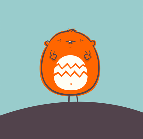
First up – making your illustration or graphics look painted onto a textured surface. I’m going use this little sleeping weeble above as demonstration, you can download the files to work with here.
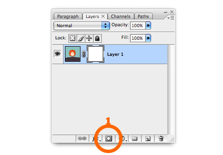
1. Create a layer mask. Open the image you want to look painted on. If you want you can download the image I’ve used here. Click the mask button on the bottom of the layer panel (1).
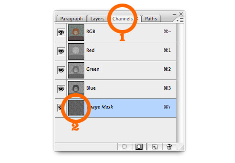
2. Stick something textured into the mask. I’ve used some wooden decking for this example, as it stands out quite well. If you’re using my photoshop file, select the wood pattern in the texture layer and copy it. Then re-select the image layer and click the channels tab (1). Select the bottom layer (alpha channel) and paste the texture (2).
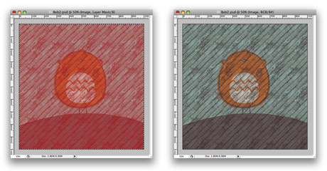
3. Finished! You should end up with something like the image on the left. You have to go back to your layers and select the image layer again to get rid of the red (not sure why…) Should now look like the image on the right.
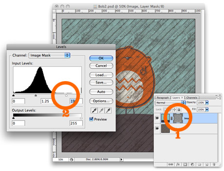
4. Fine tuning. At the moment the original image is quite transparent and a lot of the texture from the layer below is showing through. If you select the layer mask (1), then select from the menus – Image > Adjustments > Levels – you can move the white slider (2) over to the left and maybe the mid (grey) slider a little too. This’ll make the image less transparent (white = opaque in the world of masks)
The finished image:
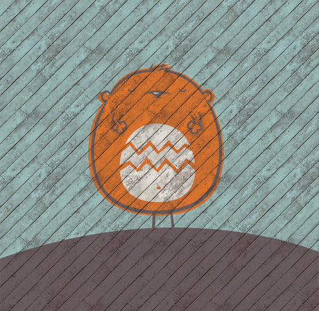
I’ve made the wooden fence/decking into repeating tiles, you can Download them here (Select the tile – Edit > Define Pattern – then you can use paint bucket to fill your page with the pattern).
Well that was my first ever tutorial, I hope it made sense!
Here’s a quick tutorial showing how to make your illustration/graphics look like they’re printed. This is pretty much the same as the first tutorial, only we’ll be using different textures for the image than the background. For this example I’m re-creating my Cookie’s Plonk desktop wallpaper.
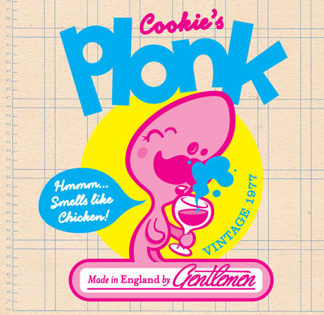
This is our starting point, check here to download the Photoshop file I’ve used.
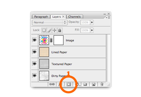
1. Create a layer mask. Open the image you want to look printed. If you want you can download the image I’ve used here. Click the mask button on the bottom of the layer panel (1).
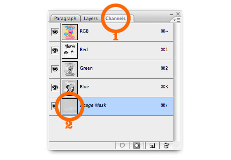
2. Add some paper texture. If you’re using my photoshop file, select the Textured Paper layer and copy it. Then re-select the image layer and click the channels tab (1). Select the bottom layer (alpha channel) and paste in the texture (2).
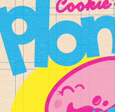
Return to the layers tab, and click the image layer. You can see above that the flat colour illustration now has the texture of the paper.
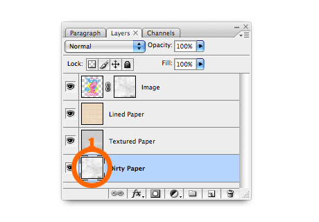
3. Add some wear & tear. To make it look a bit more realistic you might want to add some extra wear and tear. First you need to apply the first mask, select from the menu Layer > Layer Mask > Apply. Then repeat step 2 but use the dirty paper layer instead of textured paper this time.
The finished image:
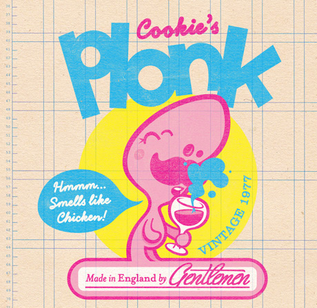
Here’s the finished image! If you quickly scroll up and quickly compare it to the starting point – it’s good at taking the edge off crisp vector graphics, making them look warmer, friendlier & more real I think.