Made in England -

Preserve - hand painted signage

Mark Spurgeon is collecting photos of old hand painted building signage on his site – Preserve. Most shots are from New Zealand and Australia so far, so if you have anymore, send them over »

Lots of great stuff on there, but I’m really taken by these massive numbers painted on doors above and below :)

Preserve - hand painted signage

(5 comments)

Feltron's 2009 Annual Report

It’s that time of year when designers across the globe check out what Nicholas Felton has been up too the previous year in his annual report. As always, meticulously recorded data and beautifully put together. Letterpressed print version available from his shop (only 2000 copies).

(no comment)

The letter K

Keep calm, I’m not going to start ripping off Jessica Hische’s ever expanding and amazing Daily Drop Cap. This ‘K’ was a rejected logo concept which I was quite fond of, so I thought I’d make a one-off drop cap to give the poor fella some purpose in life.

If you’d like to use it, paste this code at the begining of your post (in HTML mode):

<img src=”http://www.made-in-england.org/images/K-cap.png” align=”left” alt=”K”/>

(10 comments)

A Love Letter For You

I‘m loving this series of murals – A Love Letter For You, by Stephen Powers. He’s still got a few more to do (50 comissioned in total), reminds me a bit of Bob & Roberta Smith’s shop signage stuff around Hoxton Street, although Steve’s stuff is much more graphically interesting and funny.

Via: 30gms.

(2 comments)

Typekit

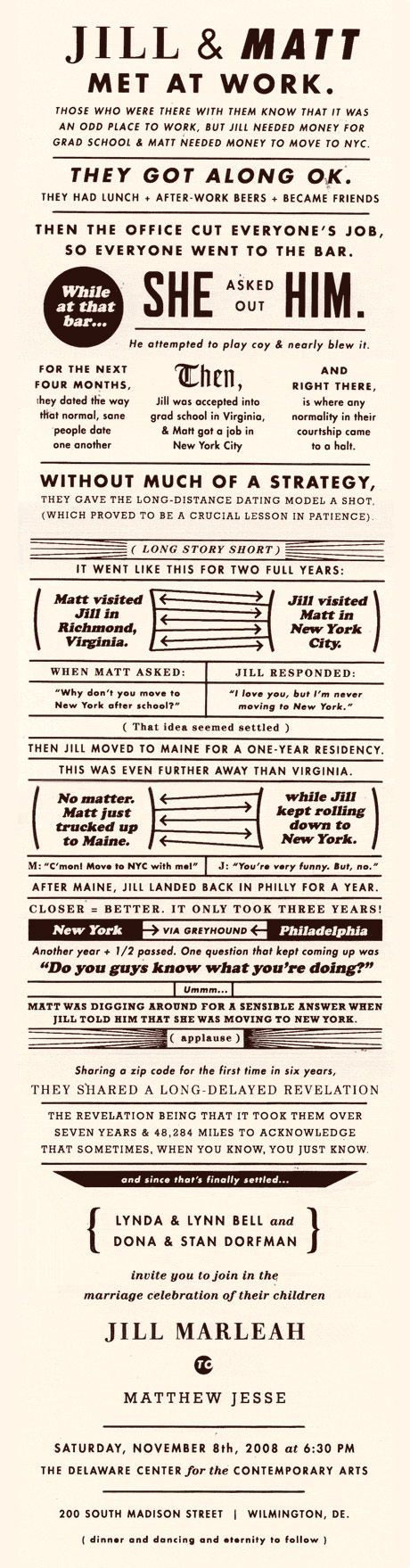
Finally I got my Typekit invite yesterday :) It’s ridiculous really when you think about how long the web has built on only a handfull of fonts.. well no longer!

All the major browsers are now starting to support this embeded font thing if you provide a URL in your CSS to the font file, great news. Problem is there’s not that many fonts that you can ‘legally’ use in this way. That’s where Typekit comes in, it’s essentially web only font licencing service, with some clever stuff behind the scenes that smoothes out differences in how browsers handle type.

You can sign up and use the free fonts (for free), or drop a bit of cash (up to $50 a year subscription) to get access to hundreds more.

“For designers and developers, this is a significant step forward. No longer will you need to trap your content in images or Flash just to express yourself visually. Pages will be more usable, accessible, and indexable.”

Buendia by César Puertas

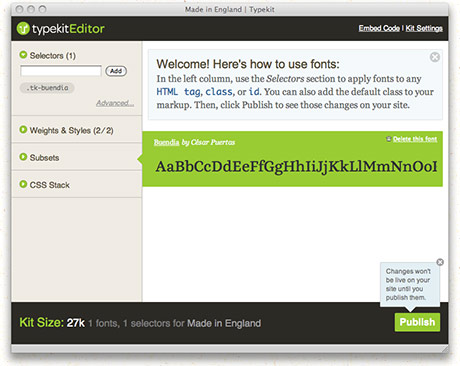
I’ve been having a little play around with it, and am currently using Buendia by César Puertas for the titles. I think it might be time for a full re-design soon though.

(6 comments)

Skwirrol - Characters Numbers

I‘ve seen plenty of custom alphabets, but can’t think of any that focused on numbers, that is until I saw this Number Character project by Skwirrol. Not quite finished yet, but I like where it’s going and eagerly anticipate the rest of the set.

(1 comment)

Mark Weaver

Mark Weaver is still knocking his retro/modern collage pieces every day, I hope he makes this one into one of his silksreen posters.

(2 comments)

There's no business like no business

I‘m loving this tee by Trademark (Tim Lahan), among all his other strange and fun creations. Also check out the tee Mr. P »

(no comment)

Daily Drop Cap - Jessica Hische

Great new pet project Daily Drop Cap, from illustrator/typographer Jessica Hische. Each day she’s uploading a new one, best of all they’re free to use on your own blog and come supplied with the code to paste into your post. Looking forward to getting the whole set.

The problem is you have to write a fair bit of text so that the word wrapping doesn’t look too weird.

(3 comments)

Wedding Invite Extraordinaire

I‘ve designed a couple of wedding invites lately so was interested to see what someone else had done when I saw this on 30gms. Wow, everykind of awesomeness! Designed by the groom Matt Dorfman, a designer from New York.

(4 comments)

Cake baking

While I’m on the subject of cakes, I came across this Threadless Cake baking competition (now ended). Basically you had to re-create a Threadless t-shirt as a cake, my favourite was this You Are The Best cake by Leslie Evans. Look at the all the bloody detail on that lettering?! Everyone seems to be using ‘fondant’ though? Not nearly as tastey as marzipan, yum yum, looks like it might be a bit more sturdy to work with though.

(1 comment)

Hand Lettering by Letman

I‘ve just been sent this guys site as reference for a project and was blown away by his work. Also mesmerised by watching him working in this video.

(no comment)

seblester - Tits & Arse

I‘ve blogged about the typographic skills of Seb Lester before, but I think he deserves another post for this excursion from his usual precise clean vector lines, to this more old school tits & arse action ;)

He’s got his first solo show coming up on the 6th August (on for a month) at the Electrik Sheep Gallery in Newcastle. I’m sure his limited edition prints will be selling fast, so if you live nearby, you should go check it out.

(no comment)

Phaeton Typeface

I‘m a massive fan of Kevin Cornell’s illustration work, so was delighted today when I saw he’s made his first font – Phaeton. Like most of his stuff it’s straight out of the Victorian era, oozing with charm & character, and chock-full of different ligatures & vignettes. You can get it for £35 from Veer.

He was helped out by typographer Randy Jones, who’s made a similar hand-drawn type – Olduvai. Sadly my budget didn’t quite stretch to that.. but it looks very nice.

(3 comments)

Wow this is pretty good, a couple of typographers and a stunt car driver make a font with a Toyota iQ. You can download the font they created here. Not entirely sure the type of people that this ad would appeal to – designers & boy racers, would be likely to buy an iQ.. but impressive bit of work none the less.

Via: Cpluv.

(2 comments)
 
4 pages