By popular demand, this is as demo of how I draw with Illustrator ;) To be honest I’m completely un-aware of how other illustrators use it and I’ve never had any lessons or read an instruction manual, this is just what what works for me. I always start with a scanned in sketch, I only draw directly on a blank page if it’s something really simple or geometric. I’ll not get into drawing and sketching here, might write another post about that some other time. I generally lock the layer the sketch is on then draw over it on another layer with the pen tool. Hopefully by watching the video you should get the idea, below is a bit more in-depth info.
The pen tool:

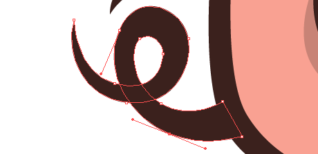
This is what Illustrator is all about for me, the pen tool is pretty much the only thing I use. I know a lot of people that don’t use Illustrator because they can’t get the hang of the pen tool, I suppose it isn’t that intuitive, but it’s pretty simple once you get the hang of it. Click and stretch – everytime you put an anchor point down you can move your cursor while the mouse button is held down to affect the curve. If for example you’re drawing a ‘s’ shape and you want the curve to flow gracefully one way to the next, just keep adding anchor points and Illustrator automatically flows the curve (no idea what the proper technical terms are for this stuff!) If you want to make a hard corner you hold down the Apple key (cursor turns to little white arrow) and click the canvas (not on the line). Now if you click on the last anchor point you can carry on as before and send the line off at a sharp angle.
Tweaking the handles:

 This is the key really, you try and draw it right with the pen tool, but you’ve always got to select the odd anchor with your little white arrow at some point and tweak them. Just click it, move it around, pull it’s handles in & out until your curves are looking just right. You can hold down the Apple key to get this tool while using the pen.
Colour palette:

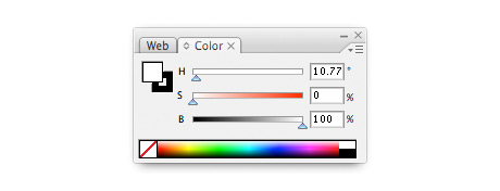
It’s down to personal preference I suppose, but I like to use the HSB colour palette over RGB or CMYK for making the colours I use. Mainly because I prefer my colours unsaturated – you can find the Hue you want with the top slider (H), then I generally take the saturation down a bit (S) slider and add a bit of black (B).
Pathfinder palette:

This is a really handy palette that I’m always using. Not sure what half the stuff does, but (1) joins shapes together – remember to click expand afterwards (from the menu bar: Object > Expand) And (2) divides over lapping shapes – remember to ungroup afterwards (from the menu bar: Object > Ungroup) Trust me, they are more useful than they sound!
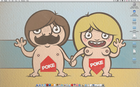
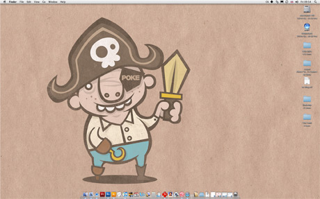
Any questions just ask! I’ll try and update this post with feedback. Confused about of pork nose? Just playing around with the Poke’s logo, which my missis designed incidently.

