This is a first for me, never done a recipe before, but don’t worry, Made in England isn’t going to turn into a cookery site, it’s just that I’m quite passionate about that tastey tastey chutney :)
I’ve made chutney on and off over the years, but I must say this last batch is easily the best to date. Also it’s a proper winter/Christmas chutney which needs at least a couple of months to mature, so if you’re going to eat it over Christmas/winter you’ll want to be making it now.
You’ll need (not far off the ingredients of a Christmas cake, make both!):
- 2 Grapefruit
- 1 Orange
- 1 Lemon
- 1 Lime
- 300g Raisins
- 500g Prunes (I used dried & without the pits)
- 500g Figs (I used dried)
- 2 Cooking Apples
- 1 Stalk of Celery
- 2 Onions
- A bit of Red Cabbage (make the rest into pickled cabbage, yum yum)
- 1kg Molasses or the darkest sugar you can find
- 1l Malt Vinegar
- Shit load of Spices (that you like). I used – ginger, chillies, garlic, mustard Seeds, citrus peel, black peppercorns, allspice, cloves, cardamom pods and cinnamon. Or you can get this sort of thing from a supermarket.
- Brandy – I didn’t, but in retrospect I think this should probably be in there, maybe towards the end so you don’t boil off too much of the booze. Whatever, improvise!
First up you’re best making the vinegar. Spicing vinegar was a big revelation for me, I’d previously bought pre-spiced pickling vinegar, but making your own is satisfying and a smell sensation, if you’ve never had your face in front of a bubbling pot of vinegar and spices, you should, it’s quite an overwhelming experience. Put your litre of malt vinegar in a pan and add all your spices. You can put them in a muslin bag if you like, or just pour everything through a sieve into another pan at the end. Heat it up and simmer away for 15 min or so, let it cool down then get rid of the spices.
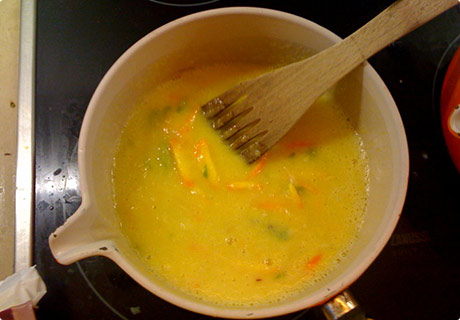
Next cut a bit of the citrus fruit peel off (trying not to get too much pith) and slice it into strips like marmalade, stick it in a pan. Cut the rest of the peel/pith off the grapefruit & orange, chop into bits and blend it to a pulp in a mixer or just stick in the pan if you don’t have one (it’ll soon get mushed up). Juice the lemon & lime and stick those in the pan.
Should look something like this:
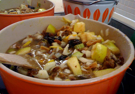
Chop apples (personally I can’t be arsed to peel them them), celery, onion and stick them in with the juices. If you’ve got dried figs and prunes like me, just give them a quick chop into smaller bits and stick them in the pan along with the raisins. Otherwise you might need to take the pits out of the prunes or something?
By this point you might realise that there’s way too much stuff in your pan (remember you haven’t put any vinegar or sugar in yet), I had to divide everything into 2 more pans. Pour in the spiced vinegar and wack on the heat.
Should look something like this:
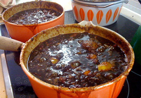
Your going to want to simmer that away until everything is soft and squishy, I think I had it going for at least an hour, but I wasn’t timing.. I thought it was looking a bit dry so added a bit more vinegar, but that was probably a mistake. When it looks pretty much like chutney you want to put the sugar in. The colour will change too an amazing rich dark brown, once all the sugar’s dissolved you crank up the heat and get a rolling boil going (prime sticking to the bottom of the pan time, so keep stirring).
I noticed that the addition of sugar made the chutney seem more runny, felt because I’d added more vinegar it now needed more veg to soak it up so I had the brainwave to stick some of the red cabbage I was dry-brining (dry-brining means covering the chopped cabbage in shit loads of coarse sea salt and leaving it overnight) for some pickled cabbage I was making later in the day.
Looks much like this:

So I rinsed some off and stuck that into the mix. I really liked the dark brown and purple colours mixed, would highly recommend this late addition.
Now it looks like this:
So now all you have to do is reduce it down until it looks pretty much like chutney consistency (maybe another hour, still wasn’t timing), it’ll thicken up a bit once you put it in the pots, so leave it a bit on the runny side.
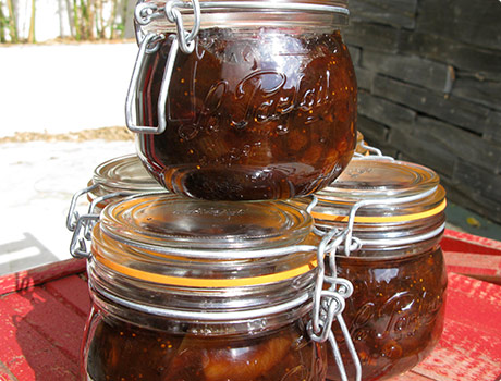
In the meantime stick your jars in the oven, I set it to 120 degrees, and stick the rubber seals (if your jars have them) in some boiling water. Essentially sterilise them. This amount of ingredients filled five an a half 500g jars for me.
When you think it’s time, spoon the chutney in the jars, seal them up and put them in the cupboard for at least a couple of months. Once cooled, I actually put them in the fridge for day or two to ‘set them’, no idea if that’s what you should do, just felt like that’s what you do with jam? I started eating the half jar you always end up with straight away, even though it’s not matured I could tell, this is going to be a friggin’ awesome batch of chutney :)
Note on jars:
We had some of those flip top jars from Ikea but they were garbage, not even a water tight seal.. We’re now using 500ml Le Parfait jars and they’re infinitely better and not really much more expensive – £13.99 for a six pack from Lakeland (£2.30 each).
Well that’s definitely one of the longest blog posts I’ve ever written, I hope at least one of you makes some damn chutney and invites me round to taste it :)
Chutney not your thing? Check out some marmalade we’ve been making, nicky might let you in on the secret recipe ;)


 eep calm, I’m not going to start ripping off Jessica Hische’s ever expanding and amazing


 reat new pet project
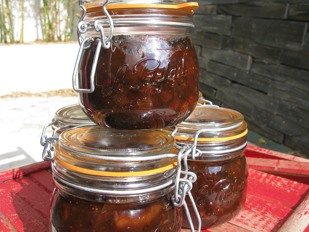
