Weekly Desktop Part 37

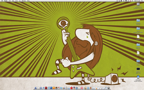
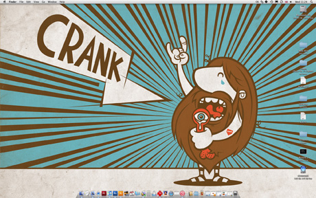
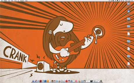
Cartoon hairy rocker, playing guitar & Cranking

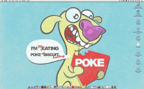
Currently I’m making some T-Shirts for the Poke band CRANK! Their first gig is coming up soon, not yet official, but likely to be April 16th at On the Rocks. Above is the design for one of them, he’s kind of a cross between Captain Caveman and the Wombles… Don’t really now why? Anyhow’s brighten up your desktop with him by downloading the image here.

Update:

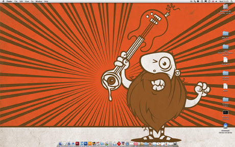
Cartoon hairy rocker, playing flying v guitar & Cranking

Flying V guitars rule! Download this one here.

Another update:

Cartoon hairy rocker, singing with his cock out & Cranking

Rocking out with his cock out… Should probably explain that the name for the band Crank came from the word cranking, meaning crying & wanking simultaneously. Just so you don’t think I randomly drew a cock on it! Download this one here.

More updates:

Cartoon hairy rocker, smashing his guitar to bits

If you know the Poke band, you might be able to guess which member this is, smashing his guitar to bits. Download the slightly less hairy rocker here.

And finally:

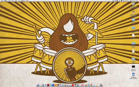
Cartoon hairy drummer

The drummer completes the set! Download Mattias here.

My Early Designs

early designs

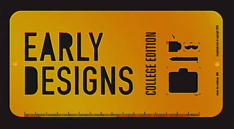
As I posted about before, Andy Whitlock from Now in Colour is running Early Designs and wants us all to show some examples of our early work and talk about how it compares to the work we’re producing now. It slightly pains me to unearth all this ancient work, but I agree with the principle that it’s quite an interesting thing to see, so here’s some examples of my Early Designs:

Illustration:

I’d say my illustration style has changed a lot over the years. But actually after going through a load of old sketches and stuff, I’d say my hand hand drawn illustration hasn’t changed much at all.
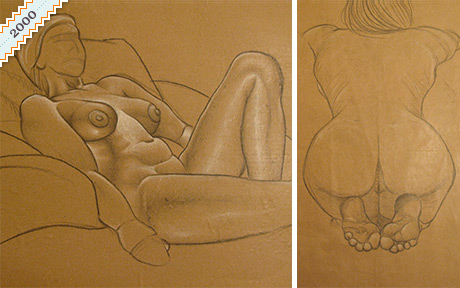
Life Drawing at school

Some stuff like life drawing, I was much better at then than I am now!
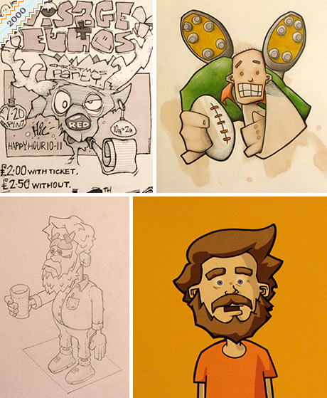
various illustrations from college years

I think it’s the tools I use that have changed, this has had the biggest effect on my illustration. The early illustration examples above are hand drawn, pencil and ink. Spirit marker & pencil crayon. I started during 2000 (because of flash) producing vector illustrations, but these were still scanned in ink drawings, then ran through streamline. God do you remember streamline :P
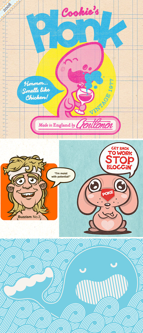
examples of my recent illustration work

Nowadays in 2008 I use Illustrator as my primary drawing tool. Which generally gives my work a more stylised & simplified look. I think my hand drawn sketches are quite similar to those of the past though.

Design:
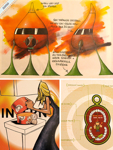
my early design work

I didn’t think I’d have much direct comparison work to show because I didn’t do web or multimedia design at Uni, I was a industrial designer back in the day. So my work (few examples above) is of products not websites. Even though it’s quite different, I can see my sense of fun in the handheld Sgt. Smiles teeth cleaning game for kids. Also my love of all things ancient and industrial, in the timer dials of the flip-top microwave.
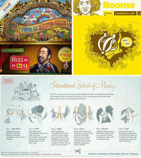
examples of my web design work

Above is more recent web design work, not really a direct comparison, but I think has a similar mood? But wait, while looking through all the old stuff I unearthed a CD containing the first ever website I built! I kind of forgotten that I’d build websites back as early as 2000 – so bear in mind that this was the first thing done by someone self taught… Now re-uploaded and not seen on the web since 2000, here’s one of my final year projects at University called Jibber-Jabber. Makes me cringe a bit, but I am impressed by the amount of man hours that went into that thing…Blighmy when did I ever find time to do any drinking!
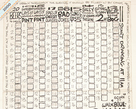
Birthday score card

Some things haven’t changed much though. I’ve always liked making charts, diagrams and interesting ways of keeping scores. Above is a birthday scorecard type thing I made for a mates 20th birthday. You can see how the more recent King & Queen of Sports scorecard below, is kind of like an evolution along the same lines.
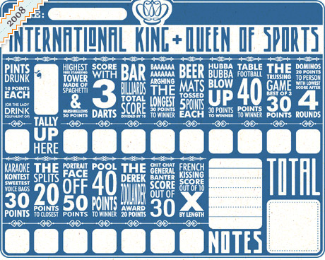
scorecard, king and queen of sport

That’s pretty much me done. Hope you enjoyed looking at my old work alongside more recent stuff to see how it compares. Now it’s your turn! Unearth those old college sketch books and post your own Early Designs.

King Cookie

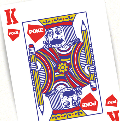
playing card, king Cookie

This is something I’ve been meaning to do for a long long time but never got round to – Illustrate myself as a playing card! Before I started I had a quick look on the web to see if anyone had a vector playing card templates I could edit, couldn’t find any… I’m sure it’d be a fairy handy thing for folk, so I’ve uploaded the illustrator file of my version of the King for you to download and use as you please. I’ll try and get round to finishing the rest of the deck at some point, but don’t hold your breath!

Are you British in Bed?

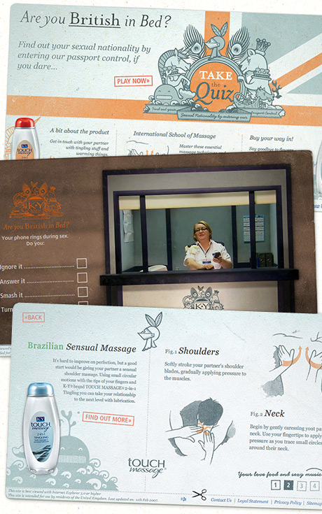
are you british in bed quiz for K-Y Jelly

Asite I designed and illustrated a while ago has just launched today, it’s the Are you British in Bed Quiz or K-Y Jelly ;)

They’ve got a new product out in the UK called Touch Massage, or how we had to refer to it endlessly in the site – K-Y® brand TOUCH MASSAGE® 2-in-1 Tingling or Warming… that rolls off the tongue nicely doesn’t it! Anyhow it’s a combination of pussy rub and massage oil, to get you all sexed up in the bedroom.

We basically built a sex quiz located in a passport control booth (I didn’t think of the idea!). It’s pretty well done if I don’t say so myself, Dezza & Russ did the flash development, Mattias did the HTML and FaceBook application. So on give it a go, it is actually pretty funny.

If you just want to get your hands on the lube, it’s available from Boots here »

Drawing with Illustrator Tutorial

By popular demand, this is as demo of how I draw with Illustrator ;) To be honest I’m completely un-aware of how other illustrators use it and I’ve never had any lessons or read an instruction manual, this is just what what works for me. I always start with a scanned in sketch, I only draw directly on a blank page if it’s something really simple or geometric. I’ll not get into drawing and sketching here, might write another post about that some other time. I generally lock the layer the sketch is on then draw over it on another layer with the pen tool. Hopefully by watching the video you should get the idea, below is a bit more in-depth info.

The pen tool:

illustrator's pen tool

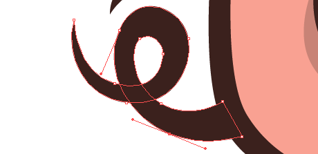
This is what Illustrator is all about for me, the pen tool is pretty much the only thing I use. I know a lot of people that don’t use Illustrator because they can’t get the hang of the pen tool, I suppose it isn’t that intuitive, but it’s pretty simple once you get the hang of it. Click and stretch – everytime you put an anchor point down you can move your cursor while the mouse button is held down to affect the curve. If for example you’re drawing a ‘s’ shape and you want the curve to flow gracefully one way to the next, just keep adding anchor points and Illustrator automatically flows the curve (no idea what the proper technical terms are for this stuff!) If you want to make a hard corner you hold down the Apple key (cursor turns to little white arrow) and click the canvas (not on the line). Now if you click on the last anchor point you can carry on as before and send the line off at a sharp angle.

Tweaking the handles:

tweaking the handles in illustrator

white arrow toolThis is the key really, you try and draw it right with the pen tool, but you’ve always got to select the odd anchor with your little white arrow at some point and tweak them. Just click it, move it around, pull it’s handles in & out until your curves are looking just right. You can hold down the Apple key to get this tool while using the pen.

Colour palette:

illustrator's colour palette

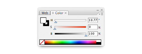
It’s down to personal preference I suppose, but I like to use the HSB colour palette over RGB or CMYK for making the colours I use. Mainly because I prefer my colours unsaturated – you can find the Hue you want with the top slider (H), then I generally take the saturation down a bit (S) slider and add a bit of black (B).

Pathfinder palette:

pathfinder palette

This is a really handy palette that I’m always using. Not sure what half the stuff does, but (1) joins shapes together – remember to click expand afterwards (from the menu bar: Object > Expand) And (2) divides over lapping shapes – remember to ungroup afterwards (from the menu bar: Object > Ungroup) Trust me, they are more useful than they sound!

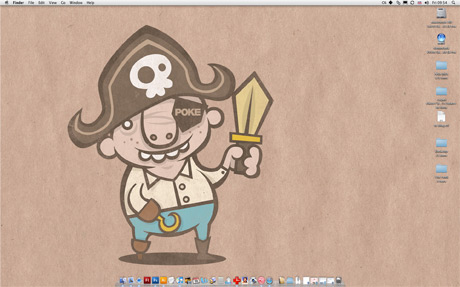
Any questions just ask! I’ll try and update this post with feedback. Confused about of pork nose? Just playing around with the Poke’s logo, which my missis designed incidently.

Printed on paper tutorial

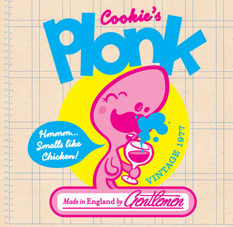
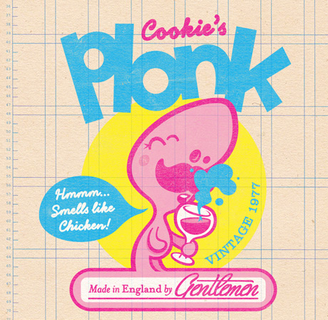
Here’s a quick tutorial showing how to make your illustration/graphics look like they’re printed. This is pretty much the same as the first tutorial, only we’ll be using different textures for the image than the background. For this example I’m re-creating my Cookie’s Plonk desktop wallpaper.

texture tutorial

This is our starting point, check here to download the Photoshop file I’ve used.

texture tutorial

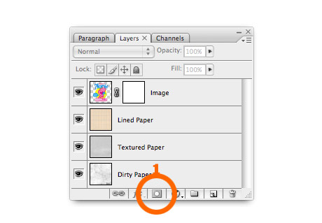
1. Create a layer mask. Open the image you want to look printed. If you want you can download the image I’ve used here. Click the mask button on the bottom of the layer panel (1).

texture tutorial

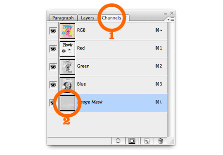
2. Add some paper texture. If you’re using my photoshop file, select the Textured Paper layer and copy it. Then re-select the image layer and click the channels tab (1). Select the bottom layer (alpha channel) and paste in the texture (2).

texture tutorial

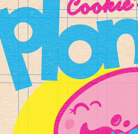
Return to the layers tab, and click the image layer. You can see above that the flat colour illustration now has the texture of the paper.
texture tutorial

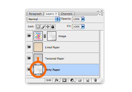
3. Add some wear & tear. To make it look a bit more realistic you might want to add some extra wear and tear. First you need to apply the first mask, select from the menu Layer > Layer Mask > Apply. Then repeat step 2 but use the dirty paper layer instead of textured paper this time.

The finished image:

texture tutorial

Here’s the finished image! If you quickly scroll up and quickly compare it to the starting point – it’s good at taking the edge off crisp vector graphics, making them look warmer, friendlier & more real I think.