
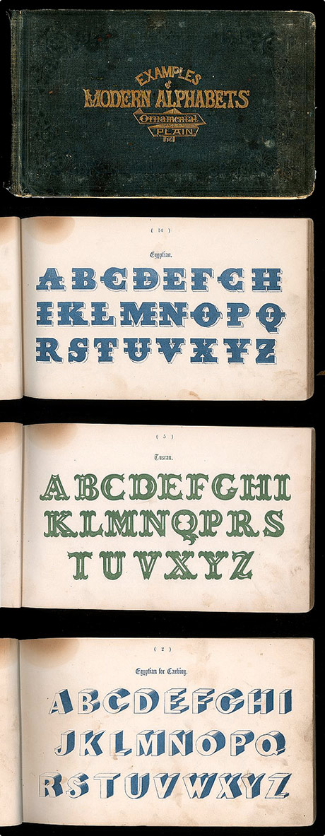
It’s funny to think that some of these typefaces were ever considered ‘modern’, but also quite surprising how ‘modern’ some of them actually are for 1864! The Modern alphabets circa 1864 was scanned by Depression Press, who has a plethora of empheria sets to check out »
Via: DETOUR.