Sticky Screen

Sticky Screen

To be honest I’m not the sort of person that plasters post-it notes all over the sides of my monitor, I either remember something or I don’t… But I stumbled across this Sticky Screen web application and have had second thoughts. It’s so bloody effortlessly easy to use, not a single button in sight, quite frankly this is so brilliant I can’t believe it hasn’t been done before. I’ve set it as my homepage and hopefully I’ll be a little more organised in the future.

Built by Jack Cheng a 25 year old art director/copy writer who’s just jacked in his job and setting up on his own. Check out his blog, it’s chock full of a lot of great thinking.

Via: yewknee

Cookie & Paul do America

Preview of Cookie & Paul do America - video documentary site.

Ihaven’t been blogging much of late and I haven’t been sleeping much either… But that’s all going to change because this is an amazing post and after I finish writing it I’m going to bed! I’ve been editing my video documentary of our successful completion of the CDT. So clear a couple of hours and check out my site – Cookie & Paul do America, use the links on the bottom to navigate between sections. If you haven’t been keeping up – The Continental Divide Trail is a 3000 mile walk from Mexico to Canada along the Rockie Mountains, we did it this year in five and a half mouths from May to October, it was epic.

It’s mostly set to music that I feel fits the mood of the section, with a little bit of chat in between. Nicky noted that most of the songs come from the 1970’s which seems quite fitting because as we make our way across America out beards get longer and longer (it’s a tradition or an old charter or something), eventually we look like we are in the 1970’s! The last finishing touch was to add in the Indiana Jones style map sequences the give each section a bit of context. Thanks to Google maps new terrian view for providing an excellent map source for me the screen grab and five million steps for plotting the route on to it :)

When I get back and finish up a few outstanding bits and pieces, I’m planning to hire a cinema/pub with a projector and have a big screening (and piss up). I’ll let you know details when I sort them out.

Well Merry Christmas internet folk, I’m off, I’ll be back in London and bloggin’ in the new year, have a good one.

Wilson Miner

Wilson Miner

Good to see a site without a white or black background, loving the shade of green used on Wilson Miner’s new site (only full green effect on the homepage mind). Masterfully laid out, I’m almost tempted to take it into photoshop and work out the grid system he’s used. If you compare it to his old site, you can see what a good job he’s done. Not surprising though he’s the guy who designed www.apple.com no less.

Woh, I’ve just been back and it’s changed colour, it’s now a kind of yellow, I’m liking.

ViaHey Buzz.

Frank Chimero

Frank Chimero

He’s just launched his new site and my smug feeling about getting vague.ly out the door have been squashed. It’s an awesome portfolio site alone, but his mid century style illustrations are even better. I came across Frank’s work after visiting his site Questionable Characters, Frank and his mate Ben both answer side by side all sorts of questions with a mixture of text, image and video.

Questionable Characters site:

Questionable Characters

Via: Drawn!

New Portfolio – Vague.ly

Vaguely interesting work by Cookie

Well I’ve found a use for that .ly domain I bought the other day, say hello to Vague.ly interesting work by Cookie. I hurriedly created a portfolio section on Made in England before I went on my big walk, which I’ve been updating since I got back. But because it’s based on a blog’s chronological CMS backend it’s a bit of a chore to browse through and find stuff I want to show people in a interview…

So I decided to look for another portfolio platform, previously I’ve used carbonmade, it’s dead easy to use but a bit restrictive with what you can do make it look like. Then I found Indexhibit, created by Daniel Eatock & Jeffery Vaska, which for my purposes is not far off perfect. First off I wanted to customise the CSS as the standard Eatock theme was a tad bland for my liking. I didn’t code the CSS for Made in England, that was my mate Nico, but I have learned a few bits here and there while trying to tweak it. Luckily Indexhibit is so simple that with a little bit looking how Nico had done it and a good deal of trial and error, I manged to get vague.ly looking ship shape in less than a day. Uploading content is a piece of piss too, in just two days I’ve got the bulk of the work done, still more to come though.

Also the reason I’m doing this is because I’m looking for work, I’m a pretty handy Illustrator as well as working in the digital industry for the past 10 years as Designer/Art Director. If you like my stuff and want to team up, you can reach me here: cookie {at} made-in-england.org

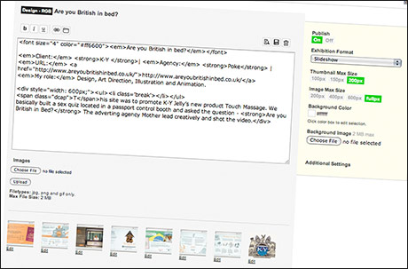
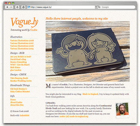
Here’s a screen grab of Indexhibit’s backend:

Indexhibit

Typography Served

Typography Served

Randomly found the site Typography Served today, chock full of great stuff like the Vinagre font pictured, by Velckro. But then I noticed that the site was powered by the Behance Network, a creative portfolio site. Seems they’re sucking in the best stuff to showcase and not just typography, they’re also serving up an Industrial Design, Motion Graphics, Photography and Fashion versions. Interesting stuff, I’ll have to get my Behance page updated a bit, I’m liking the look of what these guys are up to.

Defender of the Favicon

Defender of the Favicon

Iget quite a lot of people asking me how I made my animated Favicon next to the URL in the browser. Piece of piss, just make an animated gif 16×16 pixels, rename it favicon.ico and upload it to your root directory. But check out Defender of the Favicon, I shit you not they’ve made a playable 16×16 pixel version of the retro shooter! This really has just blown my mind.

Via Tak! blog: Flim flam.

Return to Tastebuddyland

Tastebuddyland

The campaign site for Robinsons SquashReturn to Tastebuddyland caught my eye while looking through B-Reel’s portfolio of work. Love the uber-rich photograhy mixed with the colourful illustrations. The characters were designed by Aardman Animations, but not quite as nice as Adrian Johnson’s original work on the campaign, although they have kept his type treatment which was a good move. I admit, probably more suited to the young age of the target audience though.

.ly domain names

.ly domain names

Me & Nicky just bought www.vague.ly, after seeing a post about .ly domain names on 90 Percent of Everything. They aren’t particularly cheap, cost $75 for each year over at Libyan Spider, but I quite like them :) There’s a load of cool ones still available, had to restrain myself, others we considered were: jel.ly, amazing.ly, graphical.ly, diagonal.ly, ethical.ly Not quite sure what we’re going to use it for yet, I’m sure it’ll come in handy though!